Data visualization UI: best practices and winning approaches
How can you increase the value of your apps for users? One powerful and potentially underrated tactic involves improving your approach to data visualization as part of the user interface.
Poorly designed visual-focused user interfaces may fail to live up to their potential. That's why it's important to learn how to display data effectively and internalize data visualization best practices.
What are the best practices for data visualization UI?
When considering how to optimize the performance of your app's data visualization UI, it pays to focus on a few specific guiding principles. If you let these ideas guide your decision-making process, they'll keep your efforts on the right track.
Display data accurately and clearly: Data should always be displayed with clarity and integrity, avoiding any distortions that could lead to confusion or misinterpretation. Even the best-looking and most sophisticated UI will fail to live up to its potential if it doesn't present information accurately.
Provide adequate context so users can understand data: The purpose of data visualization UI is to present clear insights to users and help them answer questions. They may want to know about performance, growth of a variable over time, the status of an account or asset or one of a near-unlimited number of other facts or figures. This means your app should include all the tools and contextual cues necessary to help those users interpret the figures they're presented with.
Scale the data for visibility on various devices: Modern data visualization design principles demand UIs that are highly scalable and flexible, with the ability to adapt automatically to different types and sizes of screens. Users' needs regarding the scale of charts, icons and more will change across the variety of devices available to them today.
Collaborate with developers early in the process: Designers shouldn't isolate themselves when working on data visualization UI. Speaking with developers as early as possible about matters such as data source access and visual rendering will help the design and development processes go more smoothly. Otherwise, designers could end up dealing with a backend that doesn't allow them to easily present the data they've determined users need most.
More specific and granular suggestions that can help you master the art of data visualization UI design include:
Use consistent visual language: When icons, graph axes and colors always mean the same thing, it's quick and simple for users to navigate your UI visually.
Make labels, legends and colors easily readable: Clear labeling, at any screen size and orientation, is also key to the overall visual clarity of your application.
Present the right chart for the job: Your choice of bar graphs, pie charts, line graphs and other visualization types contributes to the story you're telling with data.
Avoid unnecessary items: A cluttered UI can be a major problem for data visualization — if any features don't serve a purpose, they can and should be removed.
Make sure every pixel is meaningful: Every piece of on-screen real estate in a data visualization should contribute to a clear and easy-to-follow visual logic.
Embrace accessibility and inclusive design: Embracing inclusivity and highly accessible design, for example, by choosing visual cues that colorblind users can interpret, helps you reach the widest possible audience.
Enable interactions and drill-down into complex data: If you're presenting complex numbers that demand in-depth study, you can enable zooming in on specific features rather than over-complicating the primary UI.
Choose a refresh rate that makes sense for users: When data refreshes too quickly, it can be challenging for users to put it to use, while if it rarely refreshes, it could end up being out of date. Finding the right rate for your particular data set is a must.
Stay in touch with developers about UI/backend interactions: As a designer, you should be in constant contact with developers as your plans and intentions evolve over time.
Creating an application with a high-quality data visualization UI means confronting questions at every step of the design process. Every choice you make, on both technical and aesthetic levels, can contribute to the success of the finished product.
What's the best way to present data to your audience?
There is no one generic audience for every digital product. Your specific application will have a very specific target group of users. One way to determine whether the UI design process is on the right track is to ask, "Will my target audience be able to take value from this chart?"
The role of a data visualization UI is to tell a story with data. This means — instead of presenting raw figures with no context, the app will help users come to conclusions and make choices based on the information in the chart.
There are a few key questions that can help you center yourself during the design process, verifying that your chosen ways to present data visually are telling the correct story to the right audience. These include:
Who is going to be reading this data visualization, in terms of role and experience?
Based on their knowledge of this type of data, what expectations will users have?
What kinds of problems are users hoping to solve with the insights they're getting from this chart?
How can the visual design features included in this graph help users understand it and take useful knowledge from it?
What value could come from applying the concept of user stories?
Incorporating user stories into the design process of data visualization UIs is essential for ensuring that the final product truly resonates with the target audience. User stories are brief, simple descriptions of a feature told from the perspective of the person seeking the new capability, usually a user or customer of the system.
This approach is incredibly useful in data visualization because it keeps the focus on the user's needs and goals. By framing requirements in the context of user stories, designers can more effectively choose visual elements, layouts and features that not only look aesthetically pleasing but also serve practical, user-centered purposes. User stories help in creating a UI that is not just visually engaging but also functional and intuitive for the end user, making the data both accessible and actionable.
Every piece of the design process feeds into the goal of telling a clear, useful data story to a specific audience segment. Rather than asking if a visual cue looks good in general, it's more helpful to ask whether it helps people understand what they're looking at.
What are some common data visualization mistakes to avoid?
Effective data visualization UI design doesn't just mean following best practices — it also involves avoiding common pitfalls. Some design problems are particularly dangerous because they might not become apparent immediately. The general through-line between data visualization mistakes is that they lead to products that don't serve the users' best interests.
Frequent issues with data visualization design include:
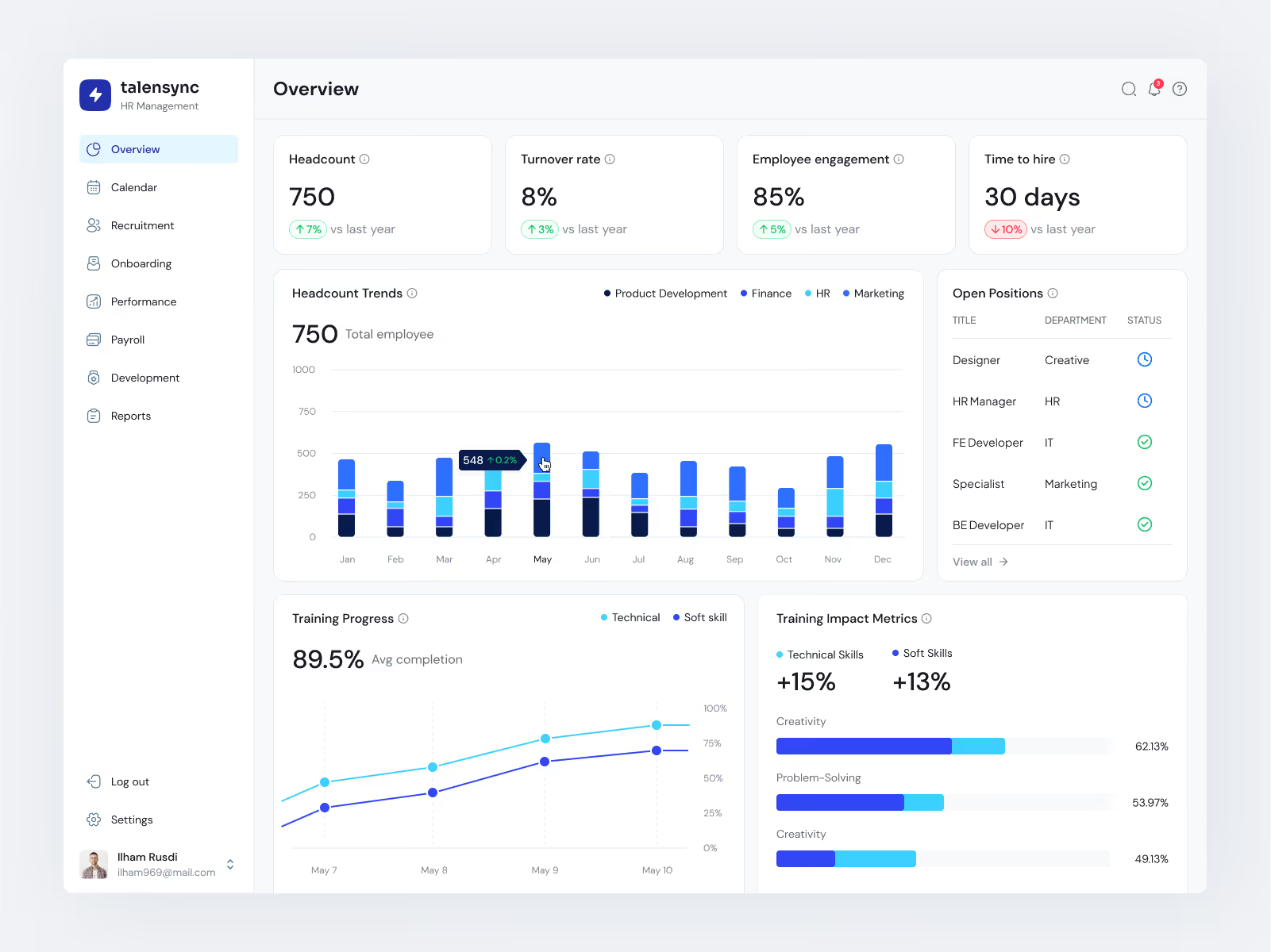
This is a donut chart, which is better for the ratio function, whereas here, the user just needs to know the count — in this case, it's best to redesign the visuals.
Using the wrong type of graph for the data: In some cases, a specific type of graph can make the importance of data unclear or, even worse, give a deceptive impression of what the figures mean.
Colors that are hard to parse: The use of colors that are too similar or clash visually can be an accessibility problem. In extreme cases, the incorrect use of color can make data harder to interpret for all audiences.
In this visualization, on the stacked columns chart, some colors are just too similar to each other to distinguish.
Design too minimal to tell a story: While it's good to strip out unnecessary information from a UI, going too far causes problems. A lack of key context or an overly minimal presentation can confuse users.
This graph isn't following data visualization guidelines in one important way: its axes are not labeled, and users have to hover over to receive an informational tool tip.
A lack of interaction: When data is detailed enough to demand interaction, transformation or drilling down, it's important to support these interactive data visualization features and make them intuitive. Otherwise, audiences can fail to fully explore the data set.
Some problems aren't universal but are rather tied to the target user profile. Creating an interface that's too complex for a general audience or too simplistic for a specialized audience can make an application less useful for its intended purpose.
How has data visualization UI evolved, and what's next?
Technology's constant evolution has affected every aspect of design best practices, and the concept of what makes a good data visualization has shifted over time. Adapting UI design efforts to keep up with the march of new tech innovations is simply an intelligent approach.
So, what has this meant in recent years?
More depth of colors for data visualization: Modern screens can show richer colors than previous generations of devices could offer, opening possibilities for greater clarity in charts.
Advanced rendering capabilities: More powerful processors allow designers to use more compelling visualization styles.
Drilldown options: Along with visually compelling primary graphs, today's devices also allow deeper explorations of large data sets.
Designers are also grappling with philosophical questions about the best ways to present data. Can one graph tell the story you're focusing on, or is it better to combine multiple visualizations? This could mean:
Showing less with more: Adding extra graphs to a screen, each contributing to a clear and minimal overall story.
Showing more with less: Answering in-depth questions through a clean, minimalistic presentation that shows only what's necessary,
In the years to come, recent trends, including the rise of generative AI, could have an impact on data visualization UI design. For instance, AI can help pick the right chart for a question or act as a companion when choosing what data to present. In the tech-saturated present and future, it can be valuable for you as a designer to pick up some development know-how alongside your design skills.
How can you master data visualization UI in your next project?
Working with expert consultants can help you with the data visualization elements of your next project. This assistance can take a variety of forms, including:
Testing.
Research.
Work on accessibility features.
Design recommendations.
Hands-on component design.
Transcenda's experts have worked with companies in all those capacities and more. Examples of these successful engagements include our collaborations with Savant, Medidata and Centric Software. In each of these cases, there was a need for an effective data visualization UI to address a very specific issue.
Contact Transcenda to delve deeper into the world of data visualization UI design.
Subscribe to receive the latest industry insights and news from Transcenda


.avif)
.avif)